Case Study: DriveTime Homepage Redesign
Project Role: Lead UX writer, research, storyboarding, internal UAT
Completely overhaul the look and feel of the DriveTime.com and DriveTime mobile app homepage and bring messaging learnings from previous experiments to the forefront of a customer's experience.
Project Background
The DriveTime homepage was in need of updating, bringing new and critical messaging concepts to a more prominent place and further differentiate our brand from our competitors.
Creative process
This project was my first opportunity to address our customer's wants and the pain points of the previous homepage. The last homepage felt disconnected from the rest of the website, so my mission was to create a more cohesive experience.
First, I researched DriveTime's competitors, analyzed their branding strategies, and identified gaps in the used car industry's copywriting approach.
Next, I developed a copywriting strategy that included key messaging pillars, a content hierarchy, and storyboarding for the customer journey.
Using my research and the messaging pillars, I started creating the copy and worked with a UX designer to ensure that the copy complemented the visual elements of the experience.
We refreshed the homepage through multiple iterations and made it more aligned with the rest of the website's experience.
01 – Imagery + Layout
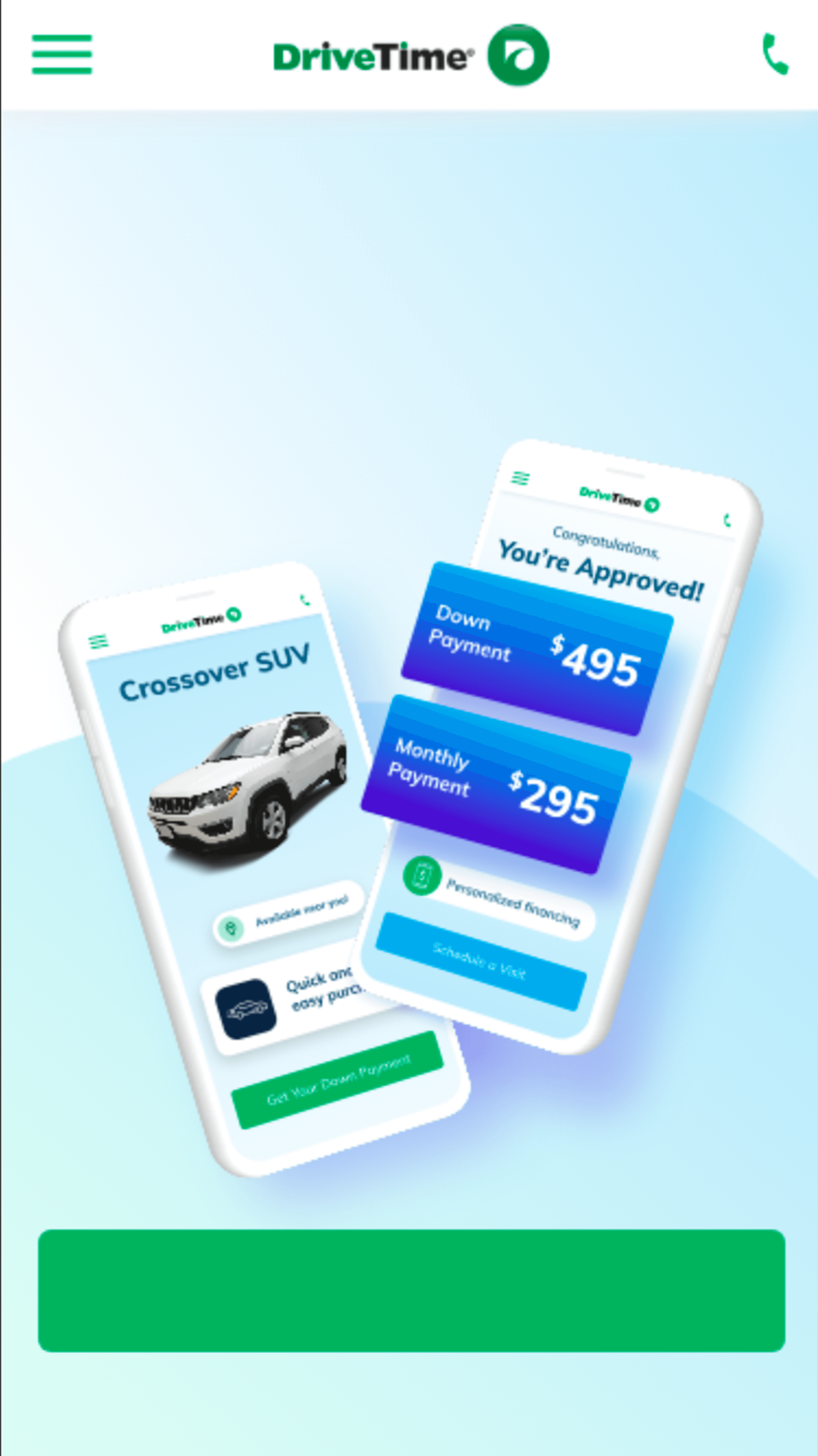
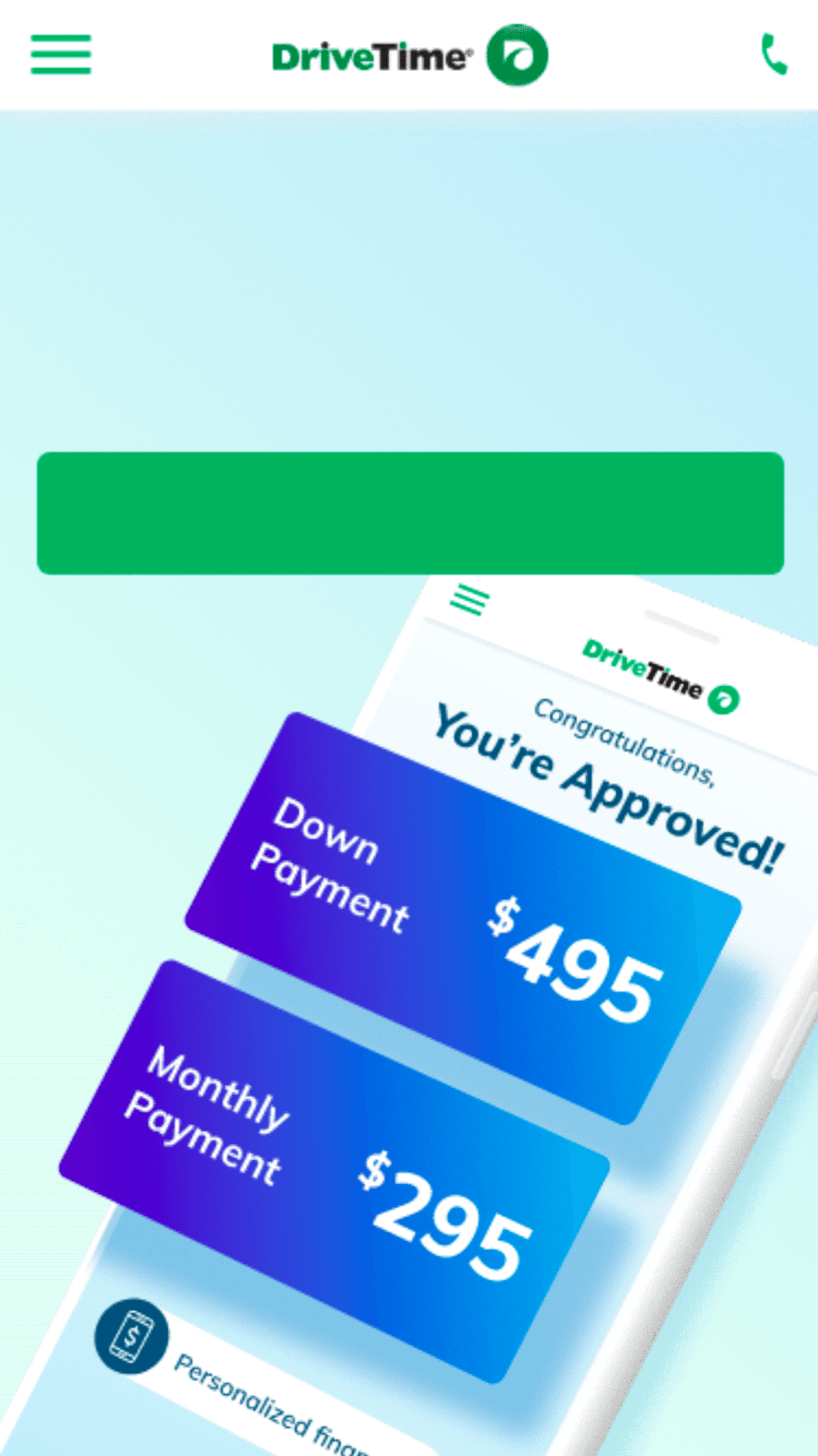
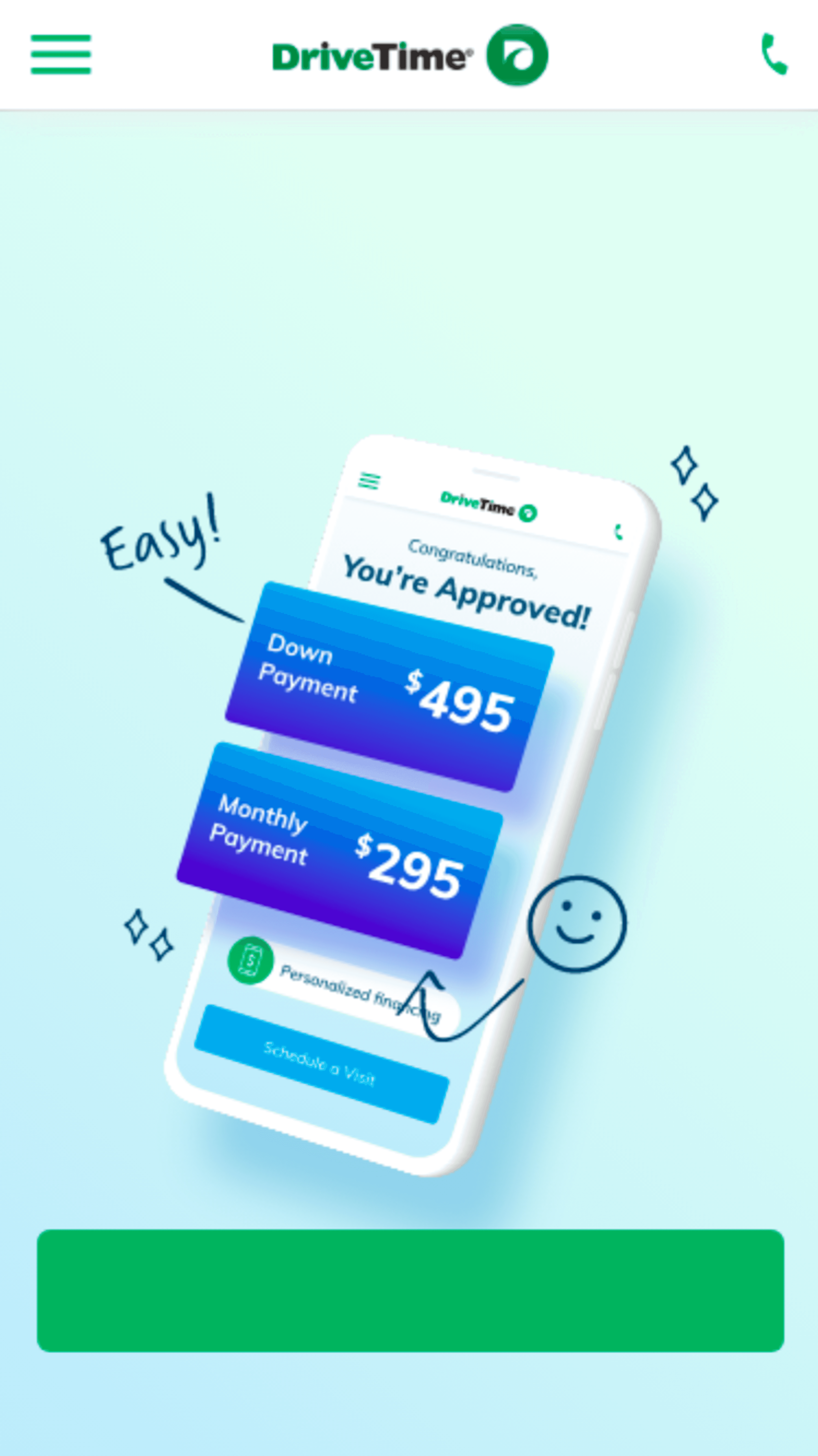
01 — Imagery + Layout Notes
UX Designer Richie Molina designed new layouts / imagery to accompany copy variations.
02 — Headline
Using previous experiment learnings and customer feedback, our UX team knew our customers had a high interest in being able to see their payment details after approval. Another critical element in this process was to work in elements that acknowledged how quickly a customer can accomplish this or that their payment terms were real and personalized.
03 — Call to Action
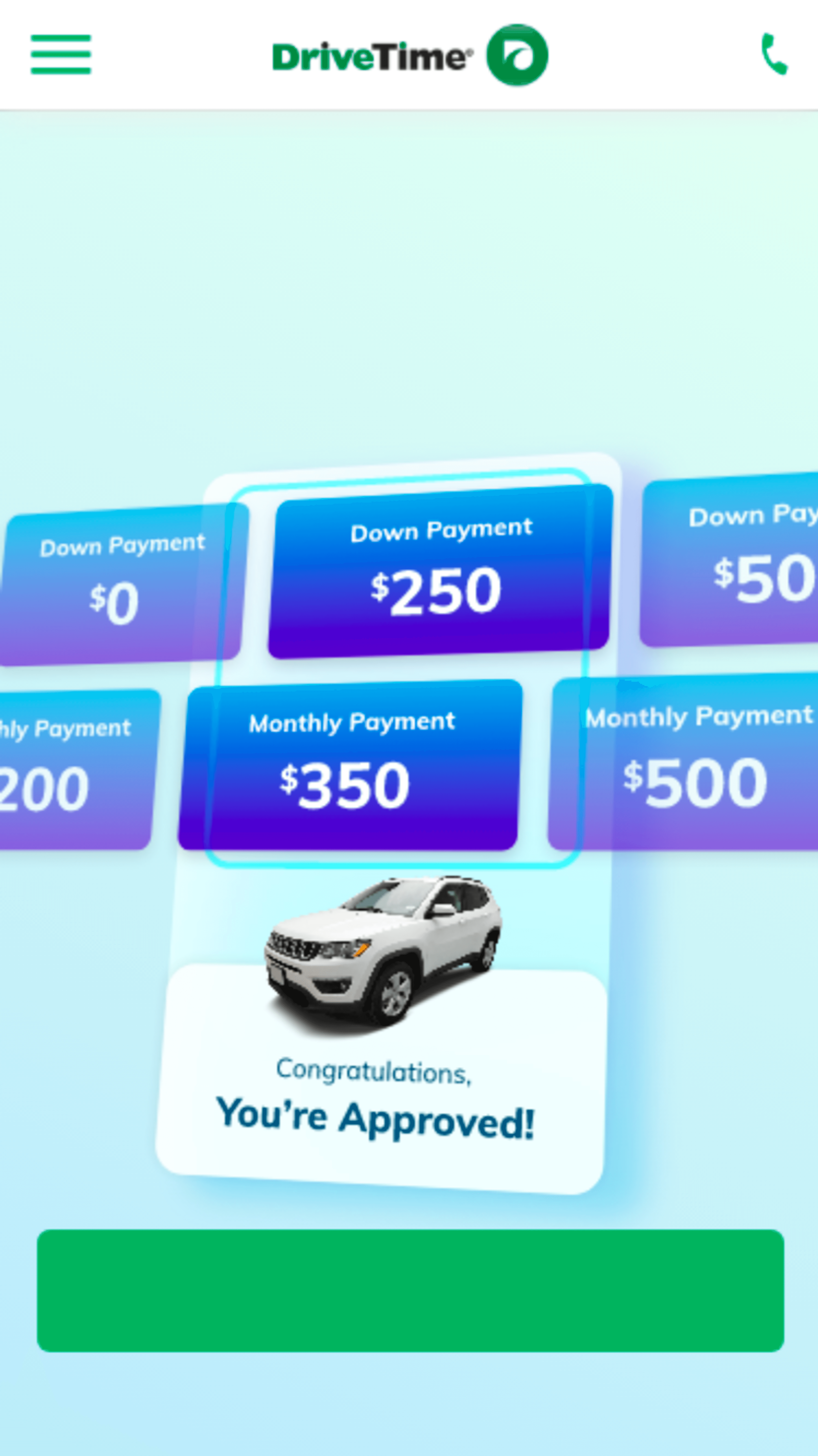
The DriveTime customer is very action-oriented and wants to know exactly what to do next when they land on the homepage. For this experiment, I didn't want to alter that but wanted to test if a more generalized "personalized terms" or "payment terms" phrase was impactful or if something more specific, like "down payment," was preferred by our customers.
04 — Results
The combination of the layout and imagery, headline, and CTA provided a 12.01% session to lead lift and a 12.15% increase in high-quality leads per session.
Altogether, we produced a 90-variation homepage test, letting session-to-lead and the quality of leads per session knock off lower-performing variants before moving forward to test the seven highest performers against control before naming this winner.
+12%
increase session to lead
+12.15%
increase in high-quality leads
+35%
increase in NPV
+10.47%
increase in session to sale